
The Unordered List HTML element can be manipulated by using CSS to create click-able buttons. Reusing a block element is efficient as the basic structure of the button set is already inherent in the UL element, all that remains to do is restyle it so that it looks and behave like buttons.
Lynda.com has 100’s of CSS course you can try for free.
To start we need a list of the buttons we want to style. The HTML is very simple:
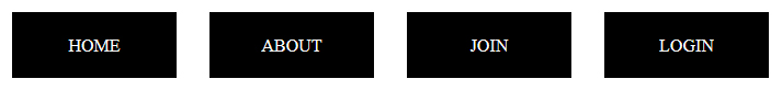
<ul id="buttons">
	<li><a href="#">HOME</a></li>
	<li><a href="#">ABOUT</a></li>
	<li><a href="#">JOIN</a></li>
	<li><a href="#">LOGIN</a></li>
</ul>
If viewed in a browser it will display as follows:
Notice that the UL element has been given the id buttons. This is used by the CSS to identify the Unordered List.
Now for the CSS. We style only two elements of the list.
- Each list item so that it appears like a button
- The link and hover action so that it has nice hover behaviour
To create the look of a button we first need to bring each list item up so that it lays horizontally rather than vertically. We do this by declaring that the elements float to the left .
float: left;
Now that the list items are aligned horizontally we need to style them to appear like buttons so we remove the list style.
list-style: none;
We align the the text to the centre, size the button by defining the width and line-height and create a space between each button by defining a margin. I have also given the buttons a background colour of black.
#buttons li {
	float: left;
	list-style: none;
	text-align: center;
	background-color: #000000;
	margin-right: 30px;
	width: 150px;
	line-height: 60px;
}
Now we style the link. We remove the line that appears under the link.
text-decoration: none;
We do this for both the link and hover actions. Also, we want the link element to behave like a block element. This will allow us to give the element background a color when we hover over it. We set the display property to block.
We now have the following CSS code.
#buttons li a{
	text-decoration: none;
	color: #FFFFFF;
	display: block;
}

#buttons li a:hover {
	text-decoration: none;
	color: #000000;
	background-color: #33B5E5;
}
As you can see I have defined the text colour for the link and the background colour for the hover action.
This is how the buttons will look in the browser. The colours can be changed and you might like the colour palettes I have defined in the article Common colour palettes.
If you want to learn more about CSS and all the related technologies you can do so with a free trial at Lynda.com.
 Read Learn Code
Leave a comment